From the inside out: first you live in it, then you draw it
Aesthetics come and go. What looks beautiful to us today may bore us in twenty years, and a geometric form that's fashionable now may end up wearing thin. What doesn't change is that a house is lived in: people sleep, cook, argue, grow up and grow old there. That's why at Unité we don't start a project with the façade, but with the life that is going to happen inside.
We call it kind architecture, and we didn't invent it. It's an idea centuries old that very different architects have told, each in their own way. Here's a short stroll through them, and through what they have taught us.
Sound, useful and beautiful
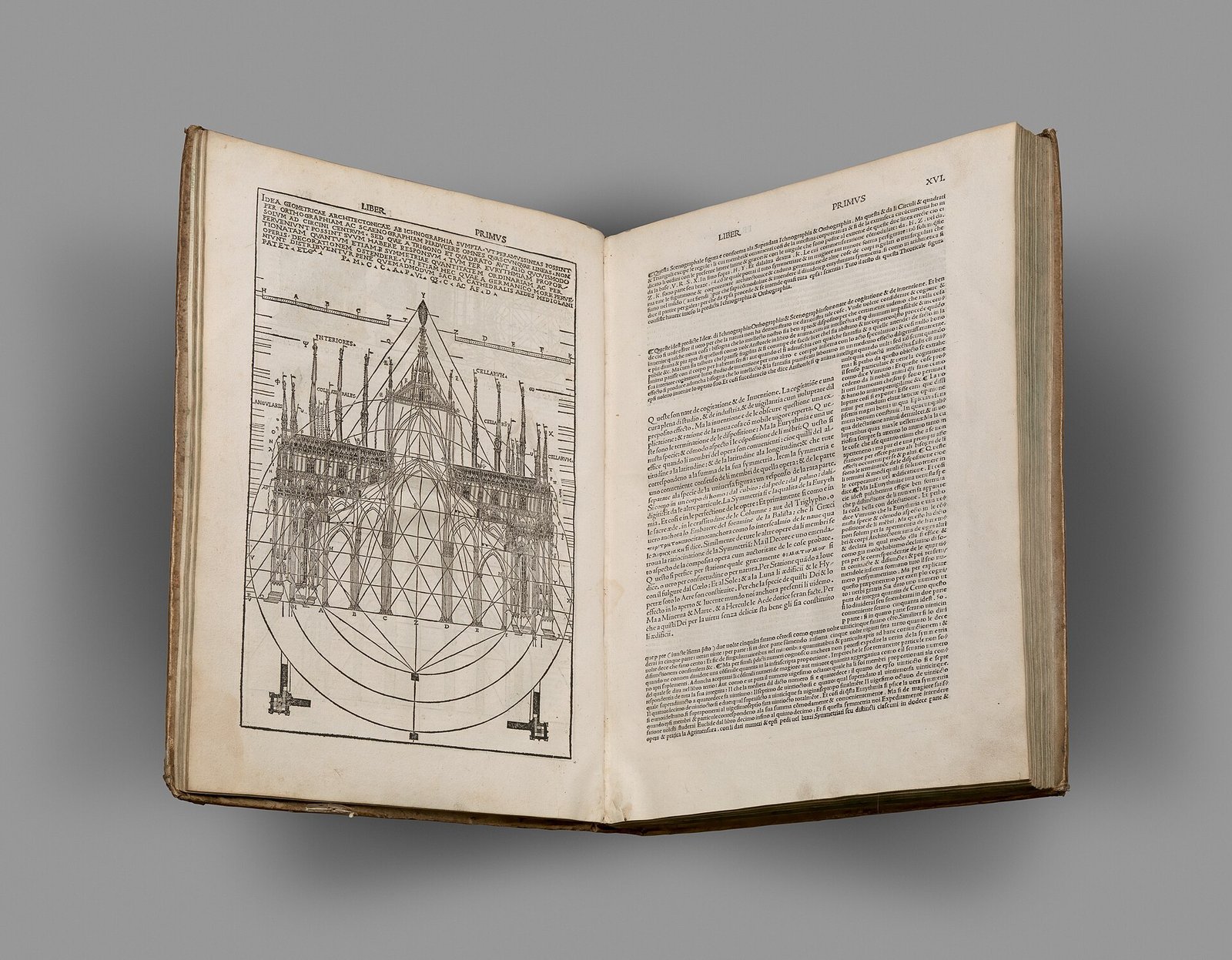
More than two thousand years ago, the Roman Vitruvius wrote that every building must achieve three things: firmitas, utilitas, venustas. That it stands up, that it works and that it is beautiful. Note the order. Beauty isn't forbidden, but it comes third, and almost always as a result of the other two.
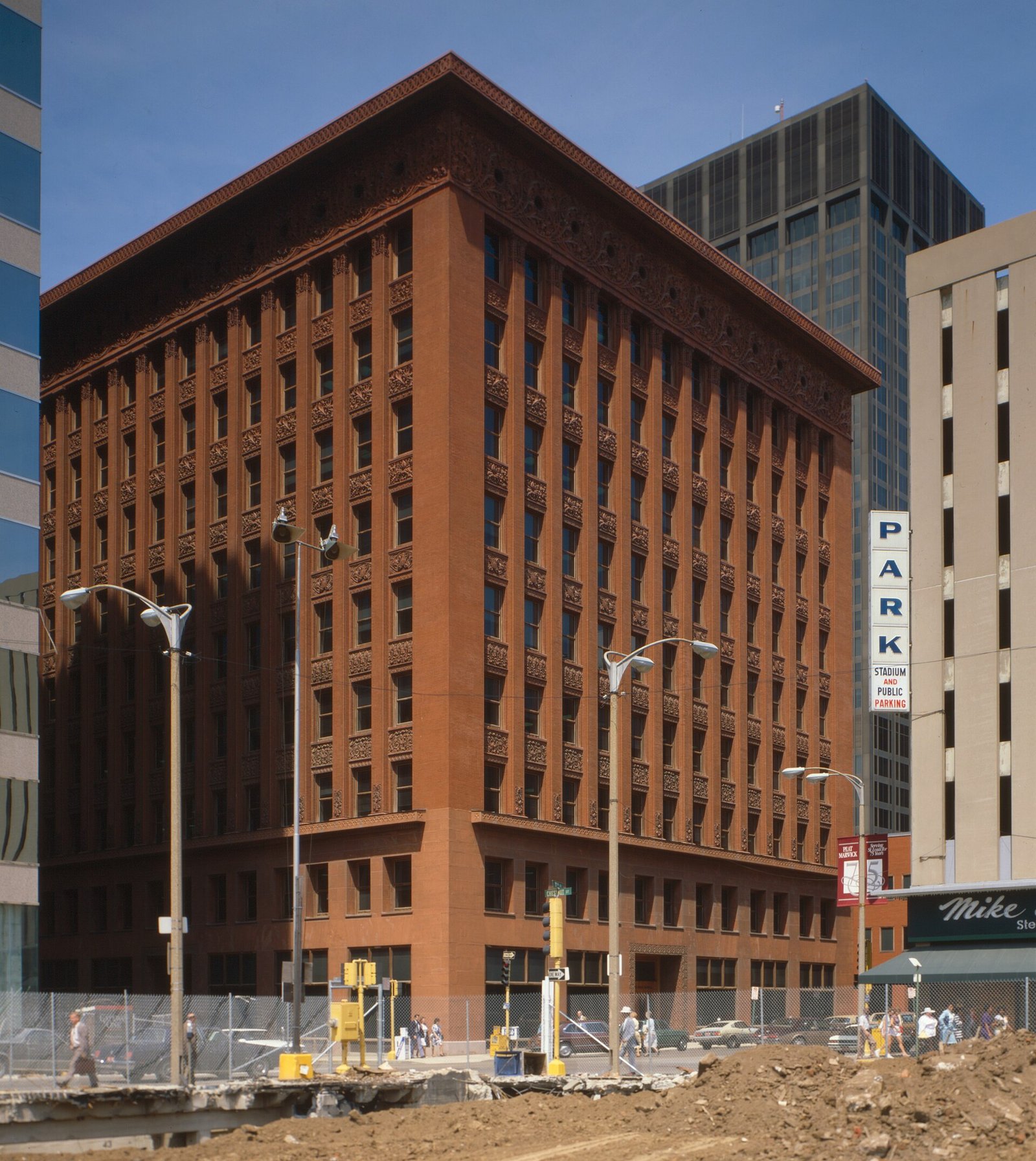
The phrase “form follows function”, so often attributed to him, came much later. It was written by the American Louis Sullivan in 1896, with the first office skyscrapers in mind: if a building is a stack of identical offices, let it look like one, without disguising it as a palace. His disciple Frank Lloyd Wright went a step further and said that form and function don't follow one another: they should be one and the same.
A machine for living in
In 1923, Le Corbusier wrote in Towards an Architecture that “the house is a machine for living in”. It's often read as something cold, and it wasn't. What he was asking for was a house that works as well as a ship or an aeroplane: with sun, air, light and just the right space for whoever uses it, without ornaments that serve no purpose.
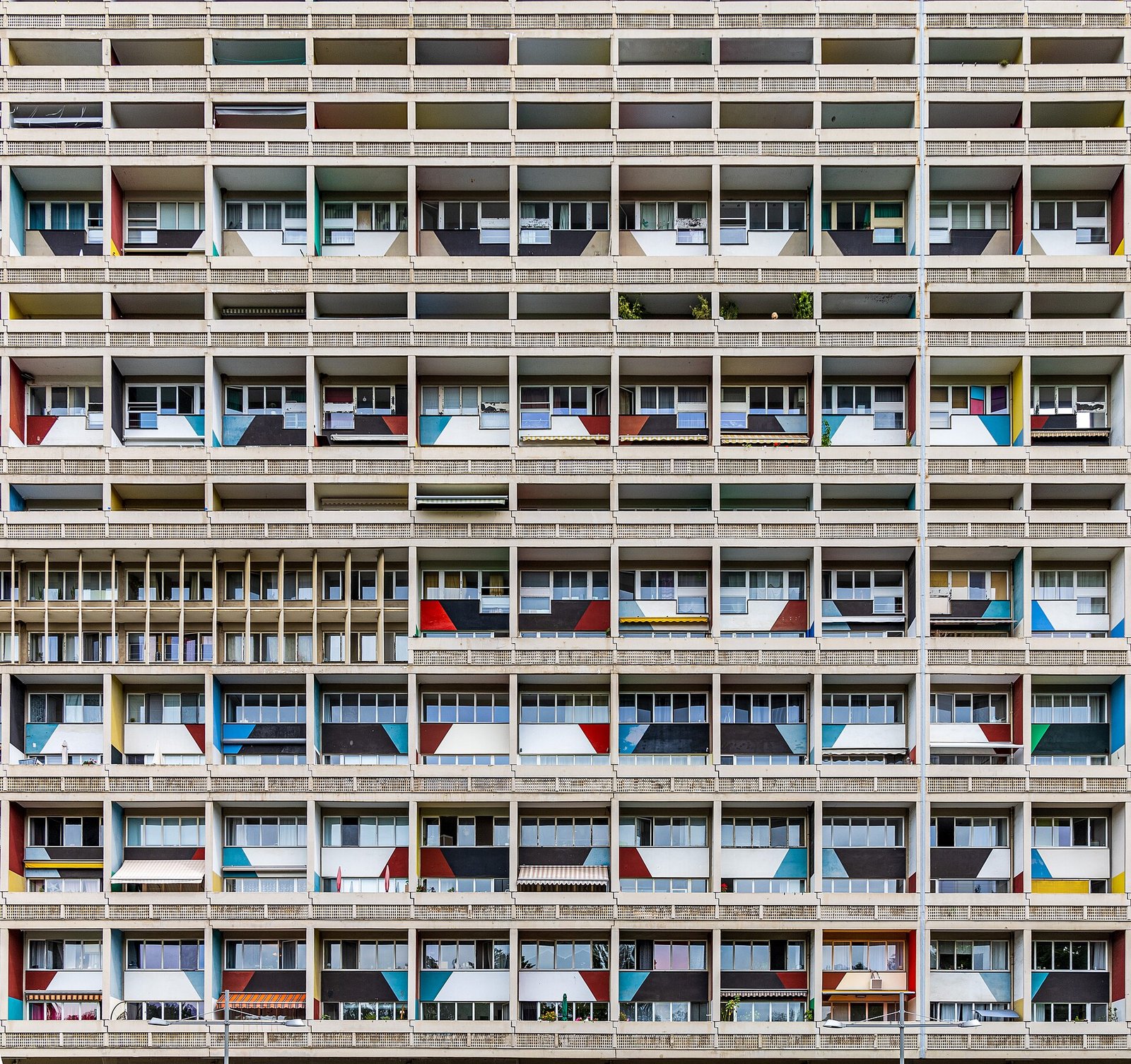
Years later he took it to an enormous scale with the Unité d’Habitation in Marseille (1952): 337 homes stacked like a vertical city, with an interior street of shops halfway up and, on the roof, a nursery, a gym and a paddling pool for the children. And he measured it all with the Modulor, a system of measurements taken from the human body. Our name comes from that building. The cover photo is its Berlin sister, built for the 1957 Interbau exhibition: behind each square of colour there is a home.
From the inside out
Wright called his way of designing organic architecture, and summed it up like this: an architecture that grows from the inside out. First the space that is lived in, and then the box that wraps it.
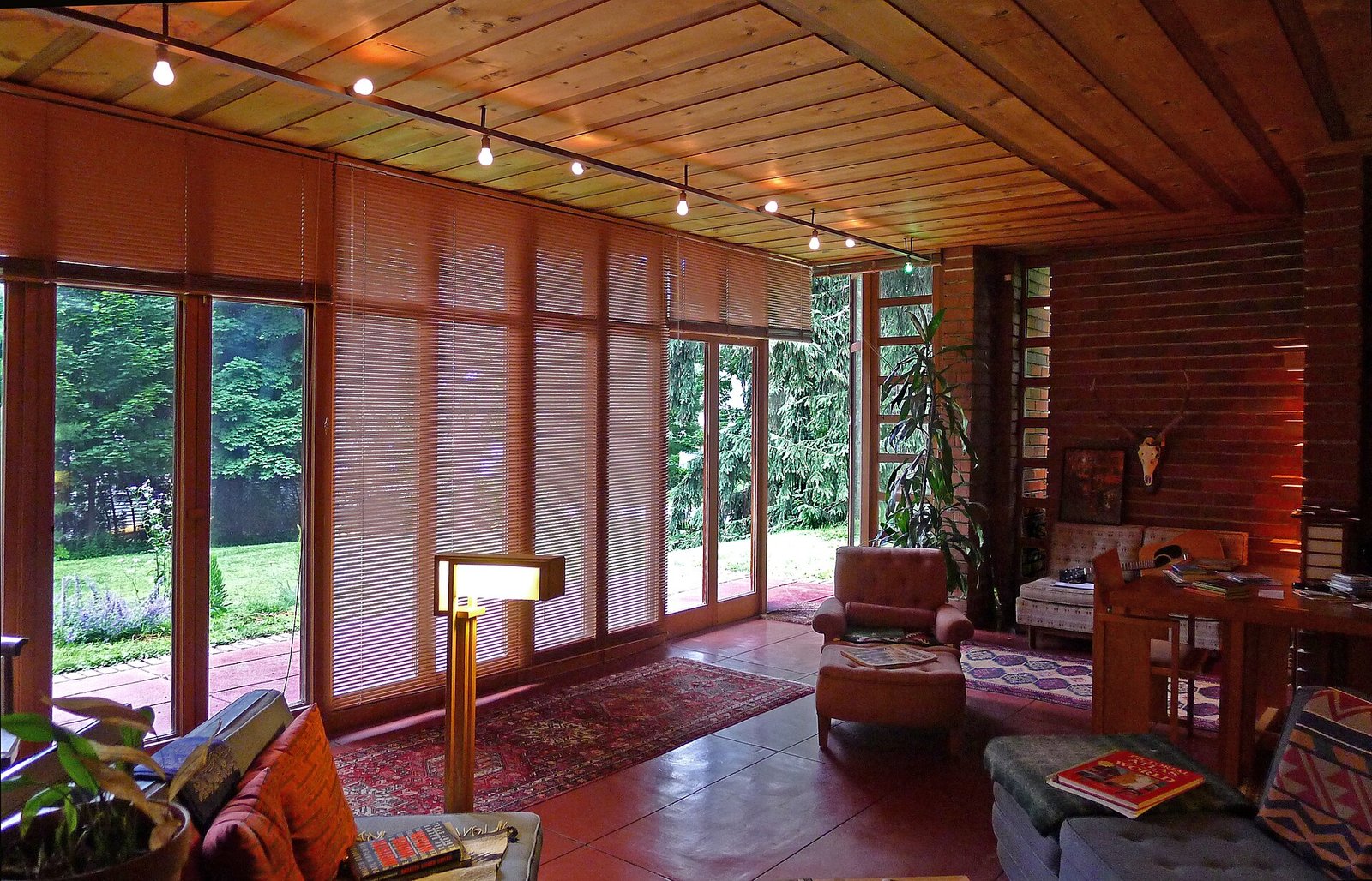
Everyone knows his Fallingwater, but we're far more interested in another of his houses, with no waterfall and no millionaires. In 1937, a Madison journalist, Herbert Jacobs, asked him for a house for his family for 5,000 dollars. Wright took on the challenge and stripped out everything superfluous: no basement and no garage (he invented the carport, a simple shelter for the car), underfloor heating and an L-shaped plan wrapping around the garden. The kitchen, at the corner of the L, sat at the heart of the house rather than hidden at the back, and the living room opened onto the garden through glass doors. It was the first of his Usonian houses, designed for the middle class. Today it is a World Heritage Site, and it is still a lesson: a good house doesn't need to be expensive, it needs to be well thought out.
The Japanese house: measured from the body
In Japan, working from the inside out has been tradition for centuries. Rooms are measured in tatami, a straw mat the size of a person lying down. As the zoologist Edward S. Morse explained in 1885, the architect designs each room for a specific number of mats. First the body, then the room and finally the house.
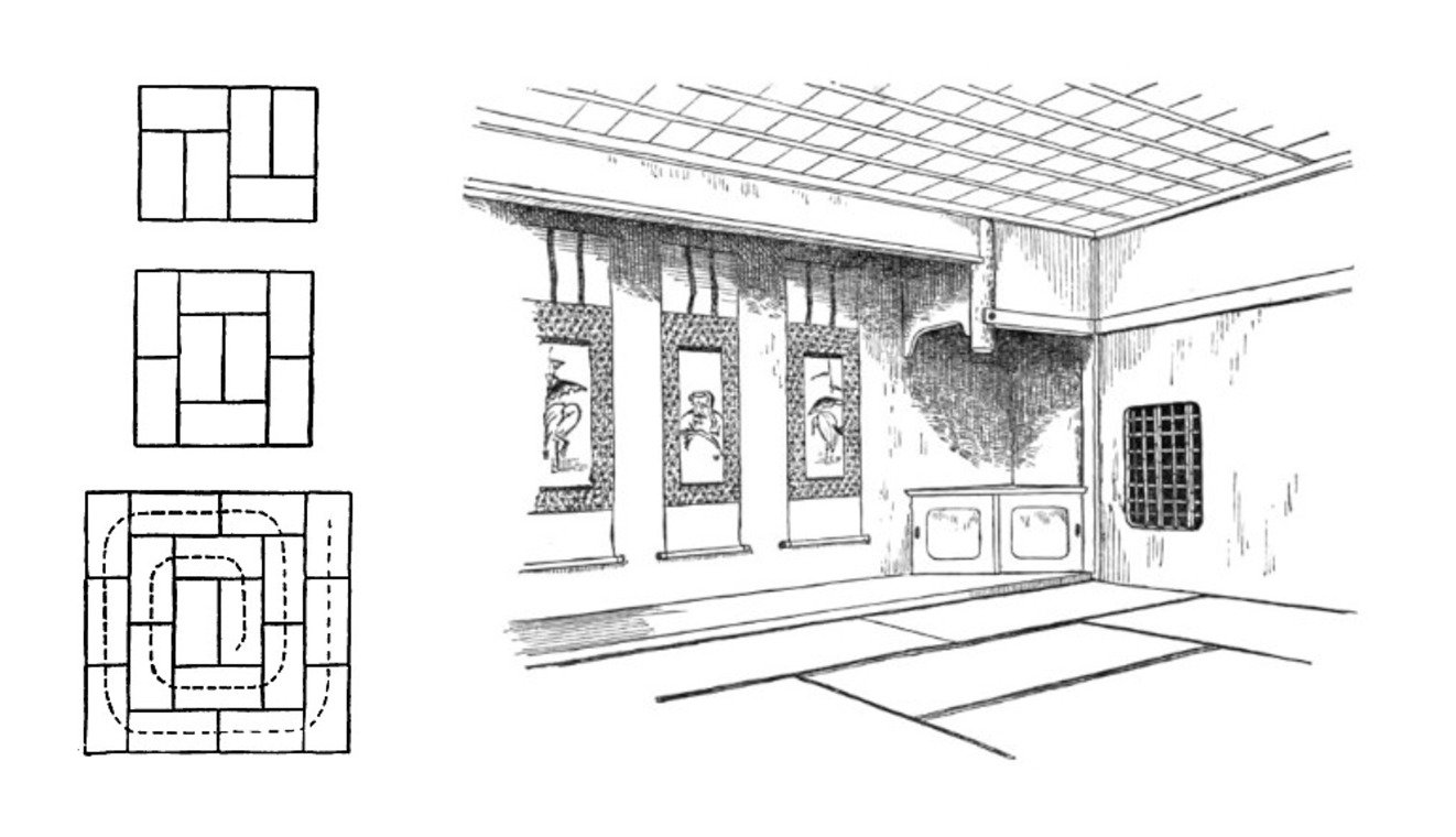
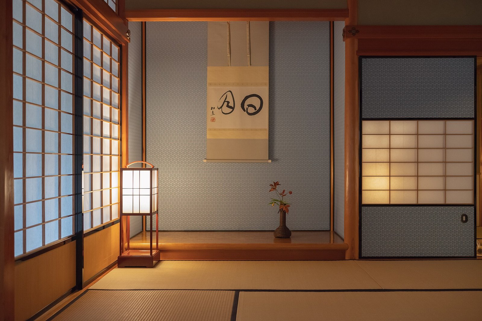
The partitions are sliding paper panels, so the same room is used for eating by day and sleeping by night. Between inside and outside there is a timber veranda, the engawa, which is neither house nor garden, and where half of life is spent. The Korean architect Inu Lee, who talks about Asian housing on YouTube, explains it through very everyday details: how the entrance welcomes you or how high the ceiling is change, without our noticing, how we feel and even how we think.
A purpose greater than technique
The Finn Alvar Aalto added the nuance we like most. In 1940 he wrote that making architecture more human means making better architecture, and that this demands a functionalism far broader than the purely technical.
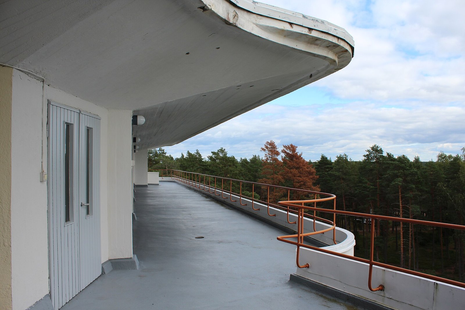
He proved it at the Paimio sanatorium, for tuberculosis patients. The sun terraces weren't decoration, they were part of the cure. He designed washbasins that didn't splash or make noise, so as not to wake the patient in the next bed, and an armchair with its back tilted at just the right angle to breathe more easily. Function, yes, but conceived from the point of view of the person lying in the bed.
Dwelling is also a smell
Because dwelling isn't only something physical. The philosopher Martin Heidegger put it this way in 1951 in Building Dwelling Thinking: we build because we dwell, not the other way round. Decades later, the architect Juhani Pallasmaa reminded us in The Eyes of the Skin that a house is also smelt, touched and heard.
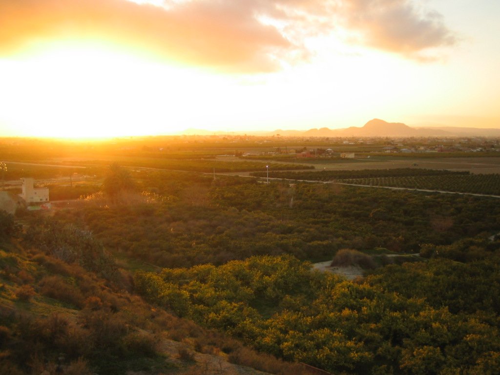
Here we get that straight away. The scent of orange blossom in the huerta, the shade of a vine in August, the sound of the irrigation channel or the coolness of a hydraulic tile floor in the morning. Nobody remembers the exact size of their grandmother's kitchen, but they do remember how it smelt. That is architecture too, even if nobody draws it.
What our grandparents already knew
Long before anyone talked about form and function, the vernacular architecture of our region was already applying it without any theory. Thick rubble-stone and lime walls that keep the cool in summer. White façades that reflect the sun. Courtyards and vines for shade, and the persiana alicantina, the roll-up slatted blind that lets air through and holds back the light. None of those houses had a famous architect behind them: their form was dictated by the climate and the way of life.
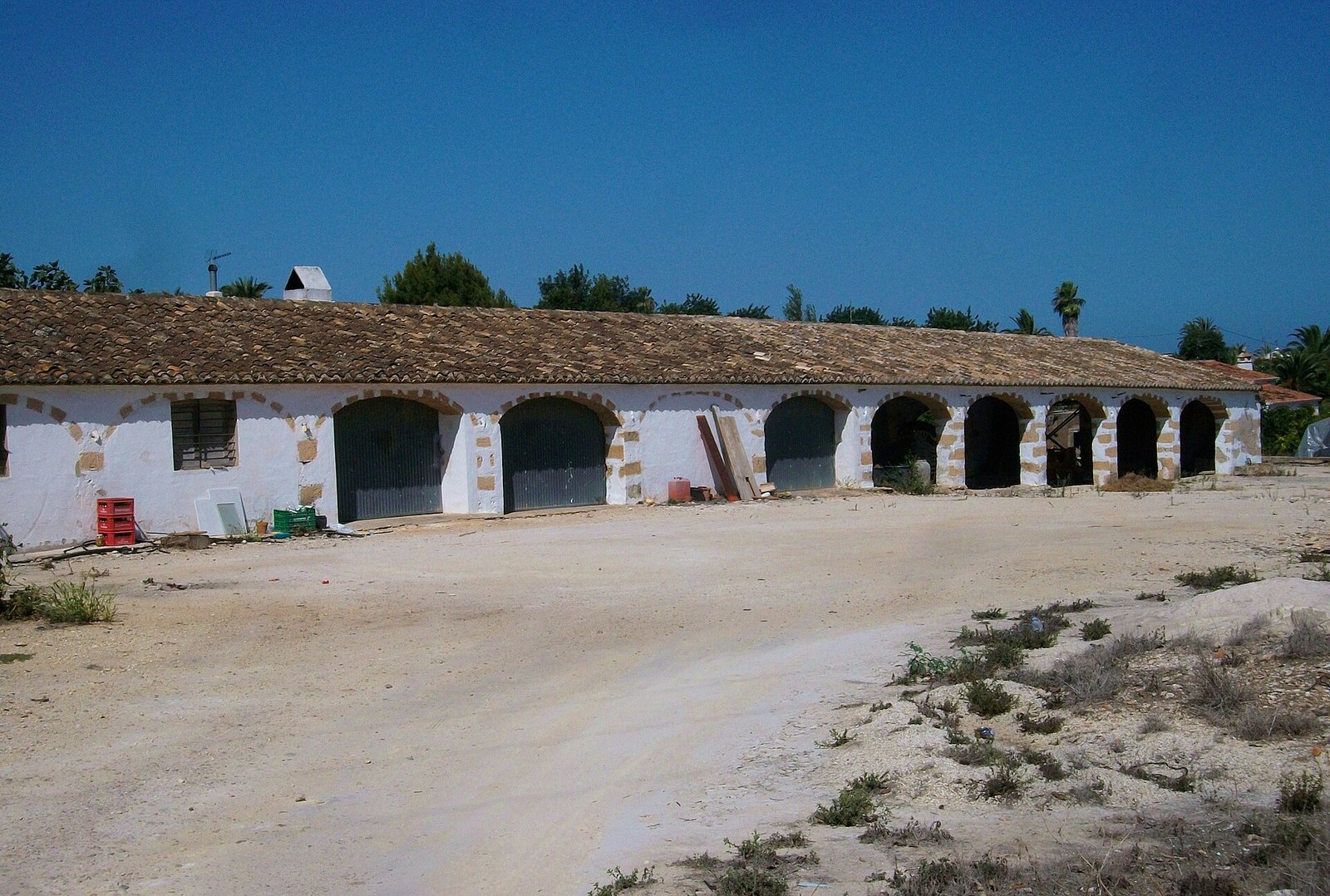
The riurau of the Marina Alta is the perfect example. An arcaded gallery open to the south for drying grapes into raisins, with room to bring the cane racks under cover if it rained. There's nothing superfluous and nothing missing. And that's why it's beautiful.
When form comes first
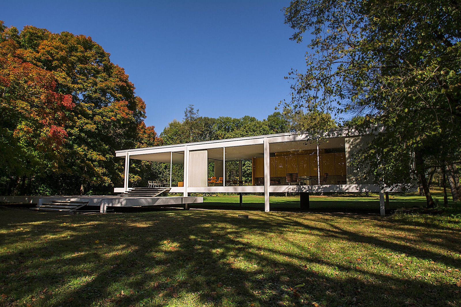
There are also cases the other way round, and they're worth knowing. Mies van der Rohe, the man behind “less is more”, completed the Farnsworth House in 1951: a glass box floating above the lawn, one of the most photographed houses of the 20th century. Its owner, Dr Edith Farnsworth, ended up taking him to court and complained that she couldn't even hang a coat hanger without thinking about how it would look from outside. It's a masterpiece, and she used it for twenty years, but it reminds us that a house also has to let you live your own way.
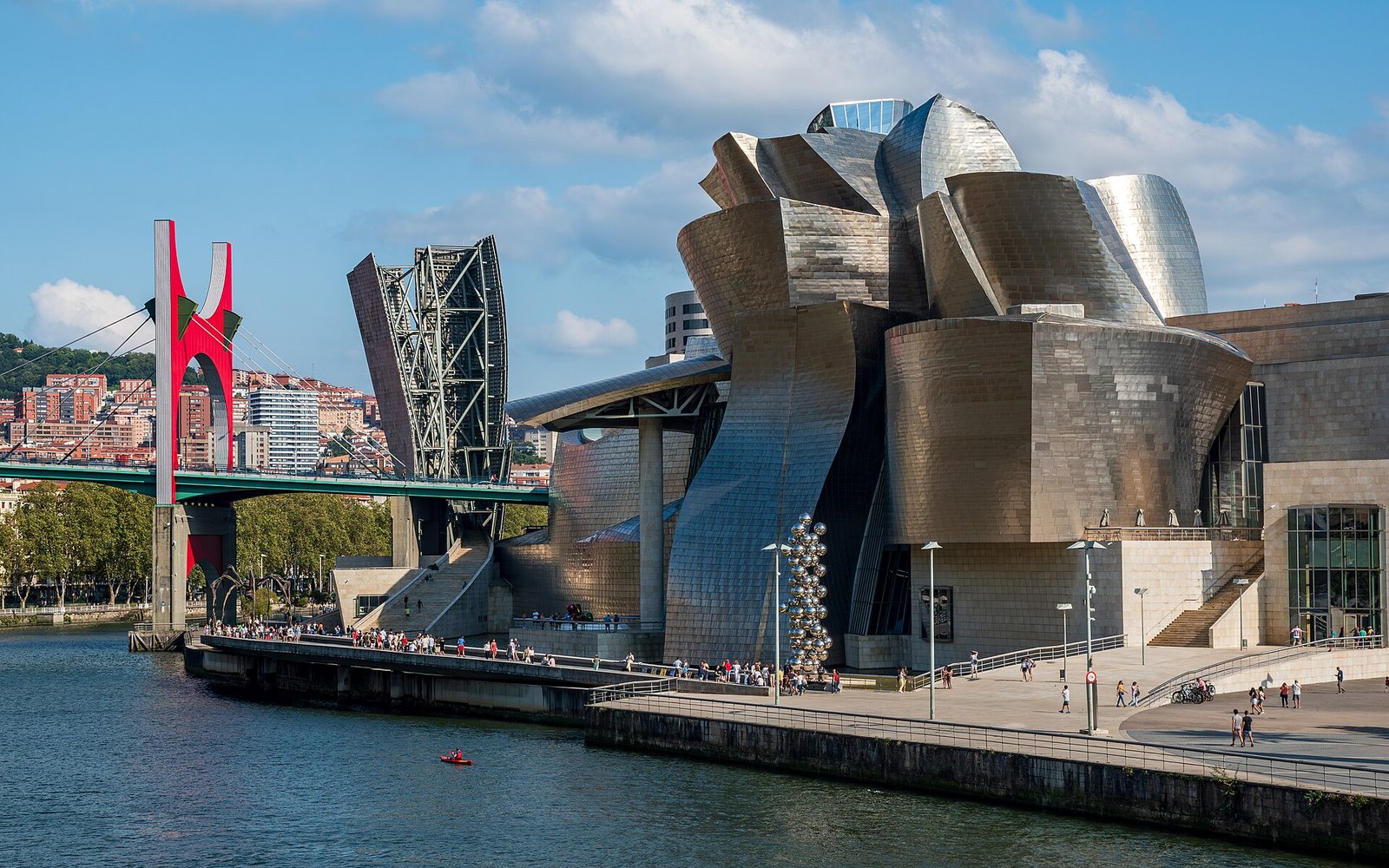
The other great example is Frank Gehry's Guggenheim, which opened in 1997 in Abandoibarra, an industrial and port area on the Bilbao estuary that had been left empty. There, form came first: an iconic building that pulled the city along with it, brought in visitors and transformed everything around it. It's the famous “Bilbao effect”. It worked, but it's the exception. Many cities tried to copy it and ended up with the expensive building and no effect.
Sitting on the floor
We'd love to do ephemeral architecture, landmarks, buildings that can be seen from afar, too. But right now what's needed is housing. So we sit on the floor with people and start with a conversation. If there's a licence, a certificate or a valuation to do, we don't think it beneath us: we treat it naturally, as an everyday thing, and that's precisely why we do it well.
What is already built
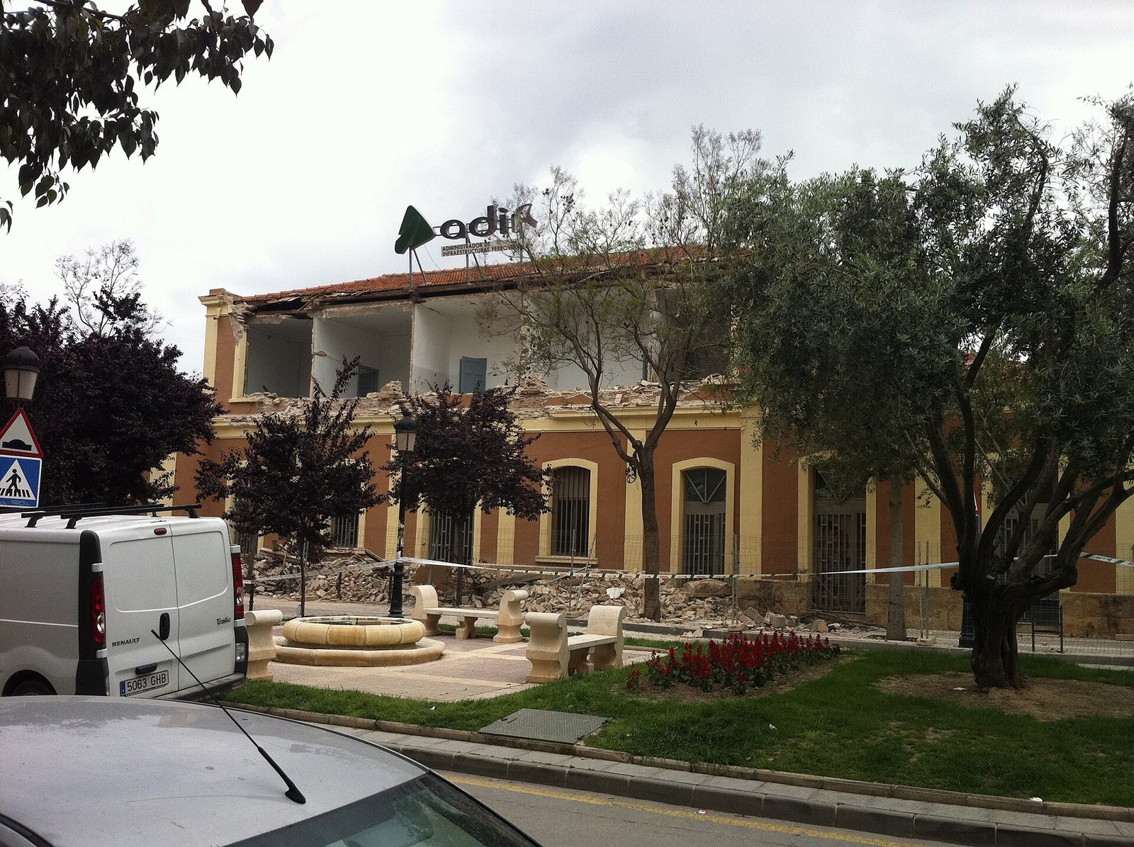
Kind architecture also looks back, at the past, present and future of what is already standing. The Vega Baja is the area with the highest seismic hazard in the Valencian Community: the 1829 earthquake destroyed Almoradí, Torrevieja and much of the district. And there are many buildings here put up before earthquake-resistant regulations like today's existed. Lorca, in 2011, reminded us what a moderate earthquake can do.
Today, commercial premises are also being converted into homes. It can be a good way of adding housing if it's done well, with insulation, ventilation, natural light, privacy and protection from street noise and pollution. Done badly, it's substandard housing at street level.
Refurbish or demolish? It depends. The French duo Lacaton & Vassal won the Pritzker in 2021 arguing for never demolishing: in Bordeaux, together with Frédéric Druot and Christophe Hutin, they transformed 530 social housing units without moving anyone out of their home, adding terraces and winter gardens, at a lower cost than knocking down and rebuilding. Other times the building is beyond repair, and the sensible thing is to group several small, poor plots into one good building, taller and with more space given back to the street. What won't do is deciding by eye. First, you study it.
A house that grows with you
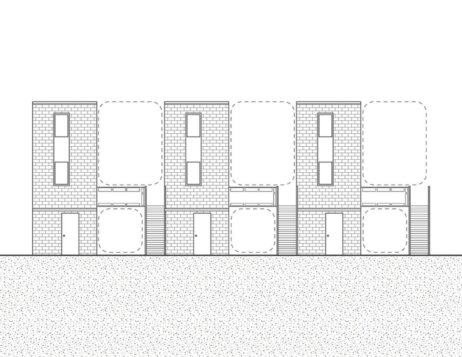
There's an idea that has been on our minds for a while. A multi-storey building that isn't handed over completely finished: a structure with the services grouped together and, in each home, a space set aside for growing. Someone living alone fills it with plants and turns it into a garden in the air. A growing family closes it in bit by bit and adds rooms. At first only the essentials are built, two bedrooms, a bathroom and a living room, and the height spreads the cost of the land better.
It sounds crazy, but it has a history. The Dutchman John Habraken proposed it in 1961 with his “supports”: the building provides the structure and services, and the interior belongs to whoever lives there. In 2004, the Chilean practice Elemental, led by Alejandro Aravena, built it in Iquique: 93 families received “half of a good house” and completed the other half themselves over the years. Under current regulations it isn't easy to fit into a permit, but it's worth putting on the table.
In short
First we understand the person and how they want to live. Then we let the form emerge from that, with a logical, constructive and economic sense. If it also turns out beautiful, and we make sure it does, it's because everything fits. That, for us, is kind architecture.
If you have a house, premises or an idea you'd like to rethink from the inside out, write to us via the contact page and we'll talk it over calmly.
Further reading
- Vitruvius, The Ten Books on Architecture (1st century BC).
- Louis H. Sullivan, “The Tall Office Building Artistically Considered” (1896).
- Le Corbusier, Towards an Architecture (1923) and The Modulor (1948).
- Frank Lloyd Wright, An Organic Architecture (1939) and The Natural House (1954).
- Edward S. Morse, Japanese Homes and Their Surroundings (1885).
- Alvar Aalto, “The Humanizing of Architecture” (1940).
- Martin Heidegger, Building Dwelling Thinking (1951).
- N. John Habraken, Supports: An Alternative to Mass Housing (1961).
- Juhani Pallasmaa, The Eyes of the Skin (1996).
- Alejandro Aravena and Andrés Iacobelli, Elemental: Incremental Housing and Participatory Design Manual (2012).
- Anne Lacaton, Jean-Philippe Vassal and Frédéric Druot, Plus: Large-scale Housing Developments, an Exceptional Case (2007).
Cover photo: Unité d’Habitation, Berlin. Matthias Süßen · CC BY-SA 4.0, via Wikimedia Commons.